A revamp of the Reebee mobile app
Timeline: May - August 2018
Role: UI/UX design
Tools: Sketch, Principle, Zeplin
Problem
Reebee is a mobile app with over 1.5 million Canadian users that allows them to browse flyers, search for items, make shopping lists, and save money by price-matching. I joined Reebee in May 2018 for a 4 month internship. As the sole UI/UX Designer there, my biggest project was to revamp the Reebee mobile app across both iOS and Android platforms. My first step when tackling this project was to examine the app on both platforms and identify the flaws and points for potential improvement. Below are a few problems that I’ve identified with the app at the start of my internship:
Android home page
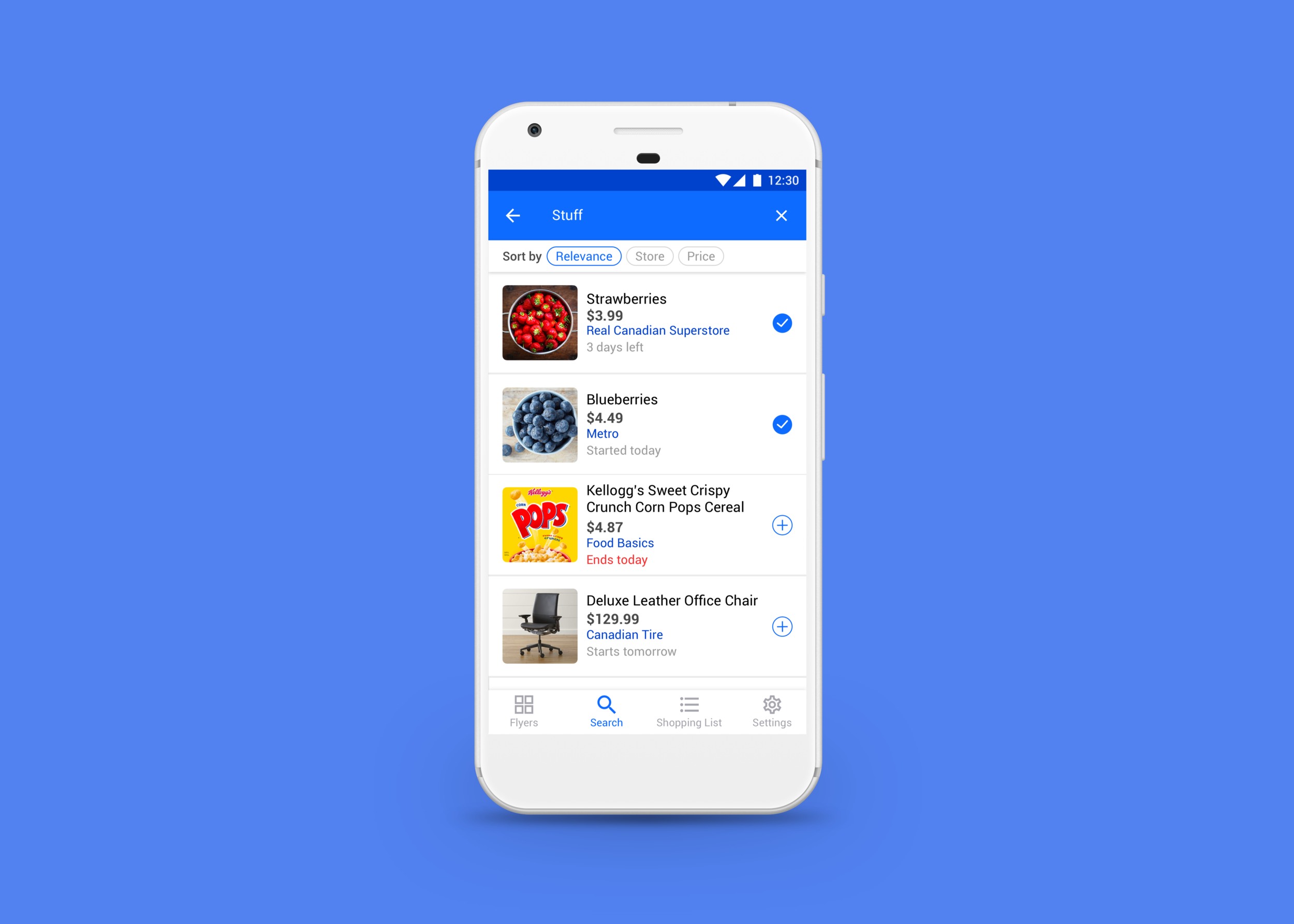
iOS search results
Android search results
iOS vs. Android differences
Revamped Search Results & Shopping List Pages
After discussing with the developers and founders of Reebee, it was decided that the search and shopping list screens needed a quick redesign to increase usability for the time being, rather than a complete overhaul. Thus, I avoided making too drastic of a change to these screens as it would have been too time consuming to implement at the time. I also chose a new primary colour for the app because the previous light blue was too low-contrast when paired with white, which was a visual accessibility issue. Below are a few of the screen mockups I made after many design iterations:
Android
iOS
The old Reebee almost felt like 2 different apps on iOS & Android, so in the redesign I made the screens look more cohesive across both platforms by maintaining consistent text alignment and iconography usage, and making sure that both apps had the same functionalities. I also got rid of the default store grouping for search results, and added options to sort results based on relevance, store, and price to cater to different users’ shopping preferences (some may only want to shop at a select few stores while some may not care where the item is sold as long as it has the best price). I also gave the Android app a bottom nav bar for easier navigation.
Learning Outcomes
iOS & Android design patterns
In the process of learning how to design a cross-platform product, I learned that iOS & Android apps each have their own design patterns.
When I reviewed my first round of design iterations with an iOS developer on the team, he asked me, “Are you an Android user?” I replied “Yes”, to which he said, “Ahh, and it shows. In iOS we generally do not see this kind of component.”
That’s when I realized that I had not considered the needs and habits of all of my users thoroughly enough, and I was trying to create a solution while not having a deep enough understanding of all perspectives. So, I dug through dozens of online resources and played around with several iOS apps to learn more about iOS design guidelines and common practices, so that I could design a solution that better caters to users of each platform.
Thus, although one of my main goals was to make the app feel more cohesive across iOS & Android, there are still a few small differences between both apps in my redesign. This was intended to make the app feel familiar and intuitive for the users who are accustomed to certain design patterns in apps that run on their device’s operating system. I learned that when designing products, you must keep in mind the users’ habits and expectations, and that what works for one platform may not always work for another.
Foraying into motion design
For certain portions of this project (not shown here), static mockups were insufficient to communicate to the developers exactly how elements on the screens should move when users interact with them. So I took the initiative to learn Principle (an animation prototyping tool) in order to help the developers better visualize the interaction animations on the UI.
What I would do differently
Working in a startup environment, the focus is often placed on constantly shipping out features quickly, and the value of research and user testing tends to be overlooked. If I had more time and resources to work on this project, I would definitely conduct usability testing with real users to validate my design decisions, and iterate upon my designs based on the feedback.