Designing a new Android app for field engineers at Diebold Nixdorf to assist them in completing service calls.
TimelineMarch - April 2020 (1.5 months)
RoleUI/UX Designer
ToolsFigma
Summary
Designed entire new Android app for field engineers of Diebold Nixdorf, increased their workflow efficiency by 83%
Translated highly complex business requirements & data models into user-friendly product
Delivered final design package in 1.5 months with no previous knowledge of field engineers’ work processes and tools
Increased SUS (System Usability Scale) score from 61 to 96 (compared to apps they’re currently using) through testing with real users
Project Overview
Diebold Nixdorf is a multinational financial and retail technology company that provides ATMs, point-of-sale terminals, and other related products/services.
Flybits was contracted to build an easy-to-use Android application that will assist Diebold field engineers in their service calls. The mobile application leveraging Flybits capabilities will provide Diebold field engineers with relevant information that will reduce the number of inbound service calls, on-site time, and likelihood of a go-back when actioning a task.
Diebold field engineers use 2 different applications to manage tickets depending on their geographical region. Siebel Mobile is used in North America and Silvanus is used in the UK. The first phase of this project will be a MVP Android app that collates information from different sources and presents it in a user-friendly interface. Ticket modification will be controlled through the Siebel Mobile (Canada/US) and Silvanus (UK) applications.
Problem & Opportunity
Diebold field engineers use several siloed mobile apps and web apps that are not easy to consume, making it difficult to locate the right information at the right time.
This ultimately impacts their ability to efficiently diagnose repairs, ensure fulfillment of customer-specific requirements and accurately capture chargeable services.
The curation and presentation of relevant information displayed in an effective manner and delivered at the right time will help reduce the total time required to complete a service call.
Leveraging Flybits platform to power the mobile application will allow Diebold to aggregate data from multiple disparate silos in a uniform and consistent manner.
Design Process
Since the target users of this app are field engineers at an external company, we began by conducting user research to understand the users’ work processes and pain points. The design process was kicked off by conducting workshops and user journey mapping sessions with the client, which was done by another member on our team. After the initial user research and project requirements had been gathered, myself and another designer were then brought onto the project to own the UI/UX design of the app.
In the span of 1.5 months, we drafted lo-fi wireframes, did usability testing with 3 real users, held 4 rounds of design reviews with client-side stakeholders, and got client sign-off on the final prototype.
The wireframes were done by another designer on the project, and I was responsible for the hi-fi prototype and any changes after the wireframes had been signed off.
User Persona
User Journey
Pre-Arrival
Pre-arrival diagnostics
Scenario: "As a field engineer, I want to see a list of all the tasks that have been assigned to me. For each of these tasks, I want to be able to select a task and see more information to be better prepared to solve the problem when I am on-site."
User value: Improve user experience via relevant information to reduce diagnostic time required onsite.Pre-arrival tasks
Scenario: "As a field engineer, I want to be aware of any phone numbers I need to call prior to arriving on-site, so I can ensure that customers are aware of my arrival (as required by designated contracts)."
User value: Reduce time spent manually searching for information; reduce the likelihood of overlooking customer-specific requirements.
On-Site
On-site tasks
Scenario: “As a field engineer, I want to have all the information I need to action the task available to me. This would include repair steps, what parts I need to use, and historical information about the equipment.
User value: Content is easier to find, view and take action on. Improve knowledge transfer to other Field Engineers.On-site debrief
Scenario: "As a field engineer, I want to complete my debrief (in Siebel Mobile/Silvanus).”
User value: Reduce reliance on multiple siloed mobile applications to complete workflow.
Challenges
Since we had limited access to Diebold’s current apps (Siebel/Silvanus), I designed mostly by looking at data models and data samples sent by the client. I referenced and analyzed the data samples to understand what data they will provide and the relationships between data fields. I then transformed that into digestible information on the UI in a structure that would make sense to end-users and would be relevant during different steps of the user journey. Snippets of data samples:
Usability Testing Results
We tested the wireframe prototype with 3 field engineers from Diebold by asking them to complete a set of tasks within their usual service call workflow.
Key takeaways from testing sessions:
Users noted that the app was intuitive and easy to navigate, and that it was easy to find the information they were looking for
Users were able to successfully complete all of the tasks asked of them using the prototype, mostly without guidance
The term “endpoint” (provided to us by client) was confusing to users, consider changing it to “equipment”, and revisit the nomenclature of some other terms such as “parts info”
As per users’ suggestions, some non-essential information will be cut out from the task snapshot and be displayed in the detail view instead, in order to improve digestibility of information and increase efficiency with which users can scroll through task list
Users noted that the new map view of nearby endpoints/calls is helpful, as they currently have to check nearby calls manually using another web app and paste addresses into Google Maps
The horizontal scroll tab menu is something users are not used to seeing in Siebel, will need to rearrange the order of tabs to ensure that users can find the most relevant information first
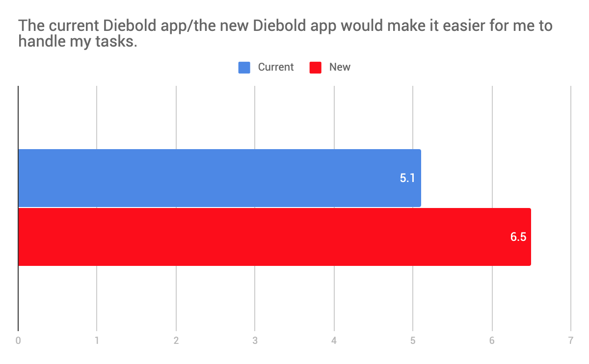
After the test we also asked them to complete a survey about the prototype. We then compared the results to the same survey about current Diebold apps (Siebel/Silvanus) that was filled out by 7 users previously. By comparing results of the surveys, we increased SUS score from 61 to 96 (current Diebold apps vs. new app prototype). Below are some other insights from the surveys:


“Great layout, great ideas, and will implement well with current systems.”
“Even though this was the first time seeing this app it was very easy to navigate.”
“I think it’s pretty intuitive and clean, the information is well displayed, I don't have to strain and look for information.”
Visual Design
Abiding by Diebold Nixdorf’s brand guidelines, I created 3 style tile options which would determine the visual design of the new app. The following option was chosen by the client:
Final Prototype
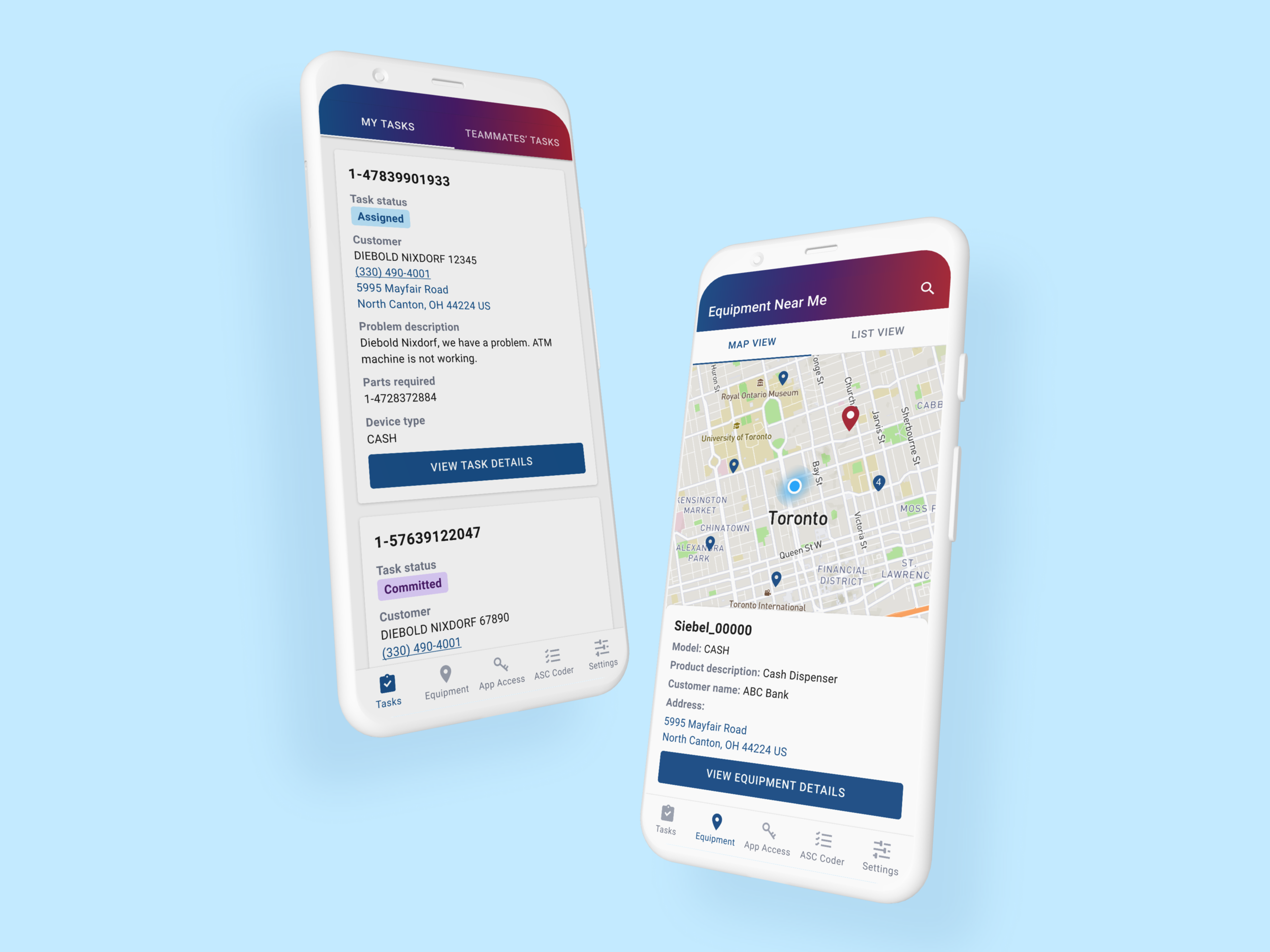
Below is the final prototype after making modifications based on many rounds of users’ and client-side stakeholders’ feedback. Main sections in the app are:
Tasks – list of tasks that were assigned to you and your teammates; detail view contains all relevant information needed to do that task, including:
problem description, equipment details, historical errors on that equipment and parts consumed, parts required, customer contact, etc.
Equipment – equipment near you that need servicing; map view to help users visualize sites in their vicinity so they can plan out their route/tasks
ASC Coder – debriefing checklist that users must complete after they finish a task; generates a code based on users’ selections which is used for reporting purposes
App Access – embedded view of Siebel/Silvanus, since ticket modification and debriefing still need to be done within those apps in this first phase
View Prototype Here
Tip: if you are unsure where to click, click anywhere on the screen and flashing blue hotspots will indicate clickable areas.
Impact
The KPIs that would indicate success of this project are:
Reduction in time spent on pre-arrival diagnostics/information search
Diebold to have insights on engagement with mobile content, time spent on-site, etc.
Call-rate improvement (reduction)
Since this project is still in development, we are not yet able to measure those metrics. However, we can infer the improvement in the first metric as we have data on the current state. Based on the survey submitted by 7 users previously, majority indicated that they are currently spending 10-30 minutes searching for information prior to going on-site.
This was greatly improved during our usability tests for the new app, as users took less than 5 minutes to find relevant information pre-arrival. Although it was in a user test scenario, it was proven that the new design made information easier to find, based on users’ positive reactions and feedback.